Welcome to the world of color mixing! If you’ve ever found yourself struggling to get the perfect shade or ended up with a palette of muddy colors, you’re not alone. Mixing colors correctly is an essential skill for artists, designers, and anyone working with colors.
In this article, I’ll share my expertise and practical experience in color mixing, helping you achieve the colors you envision with confidence. We’ll explore the color wheel, discuss the tools you’ll need, and delve into various techniques to master the art of color blending.
But don’t worry; we’ll keep it simple, informative, and relatable. Let’s dive into the colorful world of mixing!
| Key Takeaways |
|---|
| 1. Understand the color wheel and its categories. |
| 2. Use high-quality paints and various brushes. |
| 3. Gradually mix colors for better control. |
| 4. Explore color harmonies for pleasing blends. |
| 5. Avoid common mixing mistakes like overmixing. |
| 6. Start with a plan and a limited palette. |
| 7. Record your color mixes for future reference. |
| 8. Practice and experimentation lead to mastery. |
2. The Basics of Color Mixing

2.1 Understanding the Color Wheel
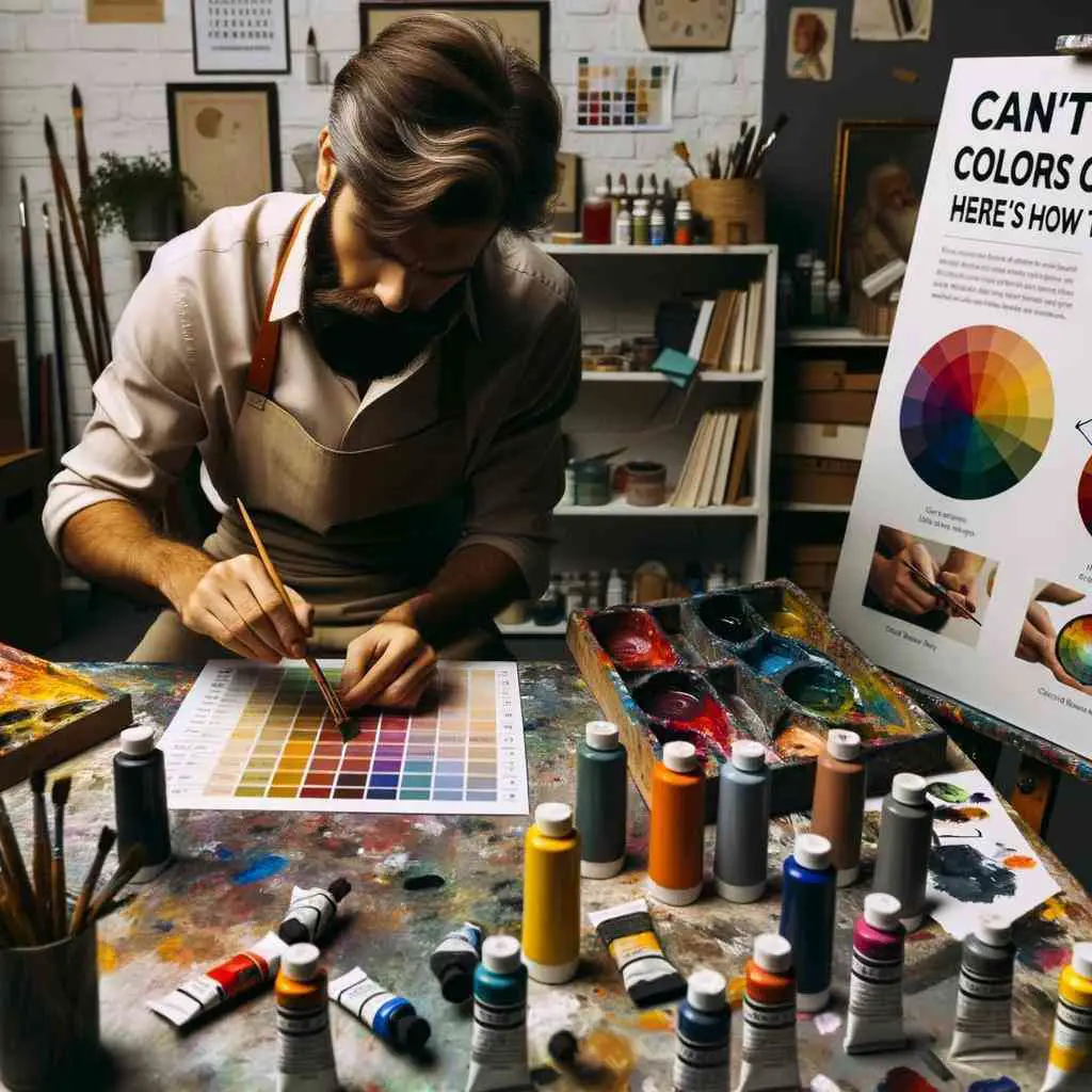
Before we start mixing colors, let’s get familiar with the color wheel. It’s a fundamental tool that organizes colors in a way that makes sense. Here’s a basic breakdown:
In the world of crafting, choosing the right supplies can make all the difference in your projects. When you’re starting a new scrapbooking adventure, this comprehensive guide provides insights and recommendations to help you make informed decisions about your materials.
Table 1: The Color Wheel
| Color Category | Example Colors |
| Primary Colors | Red, Blue, Yellow |
| Secondary Colors | Orange, Green, Purple |
| Tertiary Colors | Vermillion, Chartreuse, Azure |
The color wheel helps you visualize how different colors relate to each other. Primary colors are the building blocks for all other colors. Secondary colors are created by mixing two primary colors, and tertiary colors are a combination of a primary and a neighboring secondary color.
2.2 Primary Colors
Primary colors (red, blue, and yellow) are the foundation of color mixing. When you mix them, you get secondary and tertiary colors.
2.3 Secondary Colors
Secondary colors (orange, green, and purple) are created by mixing two primary colors. For example, red + blue = purple.
2.4 Tertiary Colors
Tertiary colors (e.g., vermilion, chartreuse, and azure) are produced by combining a primary color with a neighboring secondary color.
Watercolor painting is a delicate and expressive art form, and the type of paper you use can greatly impact the results. Dive into our guide on understanding different types of paper for watercolor to enhance your color-mixing experiences.
3. Tools and Materials You’ll Need

Now that we’ve covered the basics, let’s talk about the tools and materials you’ll need to embark on your color mixing journey. Having the right supplies makes the process smoother and more enjoyable.
3.1 Paints
Choosing the right paints is crucial for accurate color mixing. Consider investing in high-quality acrylics, watercolors, or oil paints, depending on your medium of choice. It’s essential to have a variety of colors, including primary and secondary hues, as well as white and black for adjusting tones.
Calligraphy pens not cooperating? Don’t fret! Our guide provides an easy fix for common calligraphy pen issues, ensuring smooth and graceful strokes in your artistic endeavors. Learn how to troubleshoot and get your calligraphy pens working flawlessly.
Table 2: Essential Paint Colors
| Color | Example Brand | Common Use |
| Titanium White | Winsor & Newton | Tinting and highlights |
| Cadmium Red | Golden | Warm red tones |
| Phthalo Blue | Liquitex | Intense blue hues |
| Cadmium Yellow | M. Graham & Co. | Bright yellow tones |
| Viridian Green | Holbein | Vibrant green shades |
| Burnt Sienna | Gamblin | Earthy brown tones |
3.2 Brushes
Invest in a variety of brushes, including different shapes and sizes. Round brushes are great for detailed work, while flat brushes are useful for broad strokes. Having a range of brushes ensures you can apply and blend your colors effectively.
Table 3: Essential Brushes
| Brush Type | Suitable for | Example Brand |
| Round Brushes | Detail work and fine lines | Princeton Neptune |
| Flat Brushes | Large areas and broad strokes | Da Vinci Maestro |
| Fan Brushes | Blending and texture effects | Silver Brush Grand Prix |
3.3 Palette

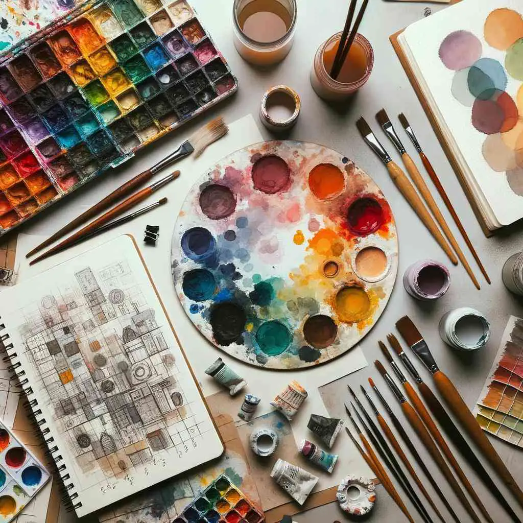
A palette is where you’ll mix your colors. You can choose from various options, such as traditional wooden palettes or disposable tear-off palettes. Make sure it’s easy to clean and has enough space for mixing your desired colors.
Showcasing your digital art in an online portfolio is a crucial step for any artist. Learn how to effectively link your digital creations to your portfolio in our quick and informative guide. Get started on linking your digital art to your portfolio and gain exposure for your colorful works.
Table 4: Palette Options
| Palette Type | Suitable for | Example Brand |
| Wooden Palette | Long-lasting and eco-friendly | New Wave POSH |
| Disposable Palette | Convenient and easy to clean | Masterson Sta-Wet |
| Glass Palette | Smooth mixing surface | Jack Richeson Grey Matters |
3.4 Mixing Surfaces
Besides your palette, you may need additional surfaces for experimenting with colors. Consider using canvas, watercolor paper, or a sketchbook to practice and test your color mixes.
4. The Art of Mixing Colors
Now that you have your tools and materials ready, it’s time to dive into the art of mixing colors. This is where practical knowledge and experience come into play. Let’s explore some essential techniques and concepts.
4.1 Mixing Techniques
4.1.1 Gradual Mixing
When mixing colors, start with small amounts and gradually add more if needed. It’s easier to darken a color by adding a touch of a darker hue than it is to lighten it once it’s too dark. This approach helps you maintain control over the mixing process.
Table 5: Gradual Mixing
| Mixing Step | Colors Added | Resulting Color |
| Step 1 | Red + Yellow | Orange |
| Step 2 | Add more yellow | Lighter shade of orange |
| Step 3 | Add more red | Darker shade of orange |
4.1.2 Color Harmonies
Understanding color harmonies can take your mixing skills to the next level. Complementary, analogous, and triadic color schemes can help you create visually pleasing combinations.
Table 6: Color Harmonies
| Color Harmony | Colors Involved | Example |
| Complementary | Opposite colors on the wheel | Red and Green |
| Analogous | Colors next to each other | Red, Orange, Yellow |
| Triadic | Equally spaced on the wheel | Red, Blue, Yellow |
4.2 Common Color Mixing Mistakes
Even experienced artists make mistakes. Let’s discuss some common pitfalls to avoid when mixing colors.
4.2.1 Overmixing
Overmixing can lead to dull, lifeless colors. Don’t be afraid to leave some variation and texture in your mixtures for added vibrancy.
4.2.2 Using Too Much Paint
Using excessive amounts of paint can result in wastage and make it challenging to achieve the desired color. Start with small quantities and adjust as needed.
4.2.3 Ignoring Color Temperature
Color temperature (warm vs. cool) plays a significant role in color mixing. Ignoring it can lead to color clashes. Pay attention to the warmth or coolness of the colors you’re combining.
4.2.4 Not Testing Colors
Always test your mixes on a separate surface before applying them to your artwork. This prevents surprises and allows for adjustments.
5. Tips for Accurate Color Mixing

To ensure you get your color mixing right, consider the following tips and strategies:
5.1 Start with a Plan
Before you dive into mixing, have a clear idea of the color you want to achieve. Reference photos or color swatches can be helpful guides.
5.2 Use a Limited Palette
While it’s tempting to have every color at your disposal, using a limited palette forces you to learn how to mix colors effectively. Start with the primary colors and expand from there.
Table 7: Limited Palette Suggestions
| Type of Art | Suggested Colors |
| Landscape | Ultramarine Blue, Cadmium Yellow, Cadmium Red, Burnt Sienna |
| Portraits | Titanium White, Cadmium Yellow, Alizarin Crimson, Burnt Umber |
| Abstract | Phthalo Blue, Quinacridone Magenta, Cadmium Yellow, Mars Black |
5.3 Gradual Mixing
As mentioned earlier, gradually adding colors ensures better control over the mixing process. Don’t rush; take your time to achieve the perfect shade.
5.4 Record Your Mixes
Keep a record of the colors you create by jotting down the ratios or making swatches. This reference will be valuable for future projects.
6. Practice Makes Perfect
Like any skill, practice is essential for mastering color mixing. Don’t be discouraged by early mistakes. Keep experimenting, and you’ll improve over time.
7. Troubleshooting Common Issues
Color mixing can be challenging, and you may encounter some issues along the way. Let’s address a couple of common problems and their solutions:
7.1 Achieving Neutrals
Creating neutral colors like gray or brown can be tricky. Start with complementary colors, such as red and green, and adjust the ratio until you achieve the desired neutral shade.
7.2 Dealing with Muddy Colors
If your colors turn muddy, it’s likely due to overmixing or using too many colors at once. Simplify your palette, mix more deliberately, and practice maintaining color purity.
Remember, every artist faces these challenges, but with persistence and a willingness to learn from your mistakes, you’ll become a proficient color mixer.
8. Applying Your Mixed Colors
Now that you’ve honed your color mixing skills, it’s time to apply your beautifully blended shades to your artwork. Here are some insights on how to make the most of your mixed colors:
8.1 Layering
Layering your colors can create depth and richness in your artwork. Start with a base layer and gradually build up the colors as needed. This technique is especially effective in mediums like acrylic and watercolor.
8.2 Blending
Blending is the art of seamlessly transitioning from one color to another. Use soft brush strokes or blending tools to achieve smooth transitions between colors, adding dimension and realism to your work.
8.3 Highlights and Shadows
Consider the play of light and shadow in your composition. Use your mixed colors to create highlights and shadows, adding realism and depth to your subject.
8.4 Experimentation
Don’t be afraid to experiment with your mixed colors. Sometimes, unexpected color combinations can lead to exciting results. Embrace the creative process and let your intuition guide you.
9. Resources for Further Learning
If you’re eager to continue improving your color mixing skills, there are numerous resources available to help you along the way. Consider exploring:
Table 8: Recommended Resources
| Resource Type | Examples |
| Online Tutorials | YouTube channels, art forums |
| Books | “Color and Light” by James Gurney, “The New Munsell Student Color Set” by Jim Long |
| Art Classes | Local art schools or online courses |
| Art Communities | Joining artist groups or workshops |
10. Conclusion
In conclusion, mastering the art of color mixing requires a combination of expertise, practical experience, and a willingness to learn from your mistakes. By understanding the color wheel, investing in the right tools, and following the tips and techniques outlined in this article, you’ll be well on your way to achieving the perfect shades and hues in your artwork.
Remember, it’s okay to make mistakes along the way; they are valuable learning experiences. With dedication and practice, you’ll become a proficient color mixer, creating vibrant and captivating artwork that showcases your expertise and passion for the world of colors.
So, go ahead, mix with confidence, and let your creativity shine!
Further Reading
6 Tips for Color Mixing: This article provides practical tips and techniques for improving your color mixing skills, helping you achieve more accurate and vibrant colors in your artwork.
Three Simple Steps to Mixing Any Color You Need: Discover a straightforward approach to mixing colors effectively, making it easier to create the specific hues you want for your art projects.
Can Primary Colors Be Mixed?: This Quora discussion explores the concept of primary colors and whether they can be mixed to create other colors, providing insights into color theory.
FAQs
What are primary colors, and why are they important in color mixing?
Primary colors are foundational hues that cannot be created by mixing other colors. They are essential in color mixing because they serve as the building blocks for creating a wide range of colors.
How can I avoid creating muddy colors when mixing?
To avoid muddy colors, start with a clean palette, mix colors gradually, and use a limited palette with a well-thought-out plan. Testing your mixes before applying them to your artwork can also help prevent muddy results.
What is the difference between warm and cool colors, and how does it affect color mixing?
Warm colors (e.g., reds and yellows) convey warmth and energy, while cool colors (e.g., blues and greens) evoke a sense of calmness. Understanding color temperature is crucial in creating harmonious color mixes.
Are there any shortcuts or techniques for quickly achieving specific colors?
While there are techniques for approximating certain colors, such as using complementary colors to neutralize hues, achieving precise colors often requires practice and a good understanding of color theory.
How can I practice and improve my color mixing skills?
Practice is key to improving your color mixing skills. Experiment with different color combinations, keep a color journal or swatches, and seek feedback from experienced artists to refine your techniques.

Hellen James is the creator of Unified Crafts and has been crafting since she was a kid accompanied by her mom to the craft store, where she was free to choose whatever ignited her imagination.

